
As a designer with a background in human behavior, I’ve found that the most profound and lasting impact comes from the smallest, most thoughtful details.
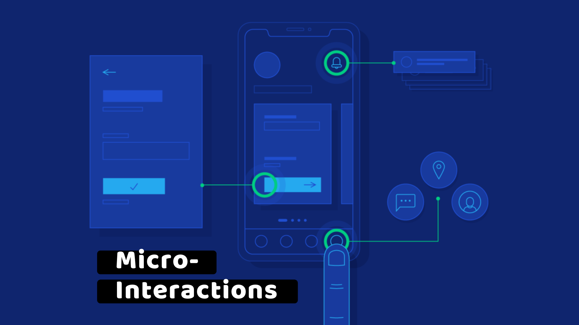
My secret to creating a seamless user journey? Neuro-inclusive micro-interactions.
These are not just decorative animations or cute pop-ups. They are tiny, deliberate design choices that proactively reduce cognitive load, mitigate anxiety, and acknowledge the diverse ways our brains process information. They are the silent heroes of a stress-free user experience, and they are essential for designing for all.
What Is a Neuro-Inclusive Micro-Interaction?
A micro-interaction is a single task or moment of engagement with a product. Think of toggling a switch, liking a post, or receiving a notification.
A neuro-inclusive micro-interaction is designed with specific cognitive and neurological needs in mind. For example, a user with ADHD may experience a brief, jarring animation as a major distraction, while a user with anxiety may find a sudden, unexpected notification to be a source of stress.
My goal is to design these moments to be calm, predictable, and supportive: creating an experience that feels effortless and reassuring, not jarring or demanding.
Case Study: Redesigning a “Loading” State
The classic loading spinner is a familiar example of a micro-interaction. But for many, especially those with anxiety or neurodivergence, a spinner can feel like a frustrating void of uncertainty.
Here’s how I redesigned a simple loading state to be more neuro-inclusive:
Before: A fast, blinking spinner with no clear indication of progress. This can increase anxiety and the perception of a long wait.
After: A slow, pulsing animation in a calming, low-contrast color. Below it, a simple, supportive message like “Fetching your data…” or “Almost there!” This tiny change provided two crucial benefits:
Reduced Anxiety: The calm animation and supportive text replaced uncertainty with reassurance.
Perceived Speed: By giving the user a sense of progress, the wait felt shorter and more tolerable, even if the actual loading time was the same.
This is a prime example of a neuro-inclusive micro-interaction in action—a small detail with a huge human impact.
My 3-Step Guide to Designing Neuro-Inclusive Micro-Interactions
Here is the framework I use to design these powerful, tiny moments:
Anticipate & Acknowledge: Before you design, anticipate the moments where a user might feel stressed, confused, or distracted. Think about the user with a short attention span, the user who is easily overwhelmed by visual noise, or the user who needs clear, explicit feedback. Acknowledge these needs as a primary design constraint, not an edge case.
Simplify & Subdue: The best micro-interactions are subtle. Use calm, low-contrast colors and smooth, predictable animations. Avoid blinking, flashing, or sudden movements that could be distracting or triggering. The goal is to inform and guide, not to entertain or demand attention. A key principle here is reducing cognitive load, which refers to the total amount of mental effort required for working memory. You can read more about this in usability expert Jakob Nielsen’s article on the topic.
Validate & Reassure: Provide clear, immediate feedback. When a user clicks a button, a subtle visual change or a brief success message confirms their action. This provides a sense of control and predictability, which is a powerful way to reduce anxiety.
The magic of these interactions lies in their subtlety. They may go unnoticed, but their impact on a user’s emotional state is profound. They don’t just improve a product; they build trust, reduce stress, and create a truly seamless and inclusive user journey for all.