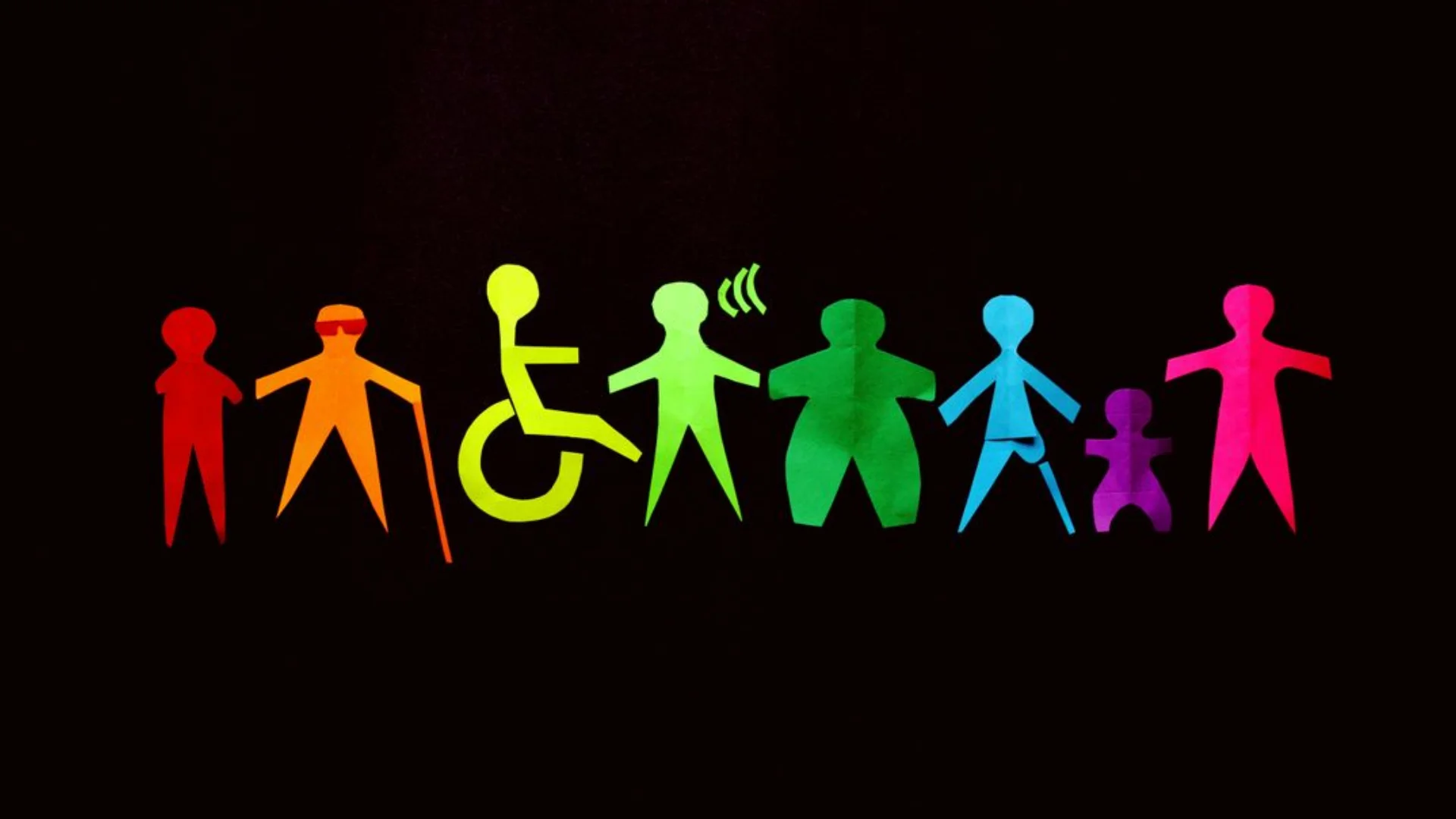
The seamless, stress-free experience that anticipates and accommodates a user’s unique mental landscape. This is especially critical when designing for invisible disabilities, a topic that is often overlooked but affects a vast portion of our audience.
An invisible disability is a physical or mental condition that is not immediately apparent to others, such as chronic pain, anxiety, or traumatic brain injury. A significant and growing category of these is neurodivergence, which refers to the natural variations in human neurological functioning, including conditions like ADHD, autism spectrum disorder, and dyslexia. Designing for this audience is not about creating a separate, siloed experience; it’s about applying principles that make the web better for everyone. At the heart of this challenge is a core psychological concept: cognitive load.
What Is Cognitive Load?
Cognitive load is the total amount of mental effort being used in the working memory. Think of the working memory as your brain’s temporary storage and processing unit. It has a limited capacity, and when a design forces it to work too hard—by presenting too many choices, confusing instructions, or unnecessary distractions—it can lead to frustration, errors, and disengagement.
The goal of a neuro-inclusive designer is to reduce this extraneous cognitive load, allowing the user’s mind to focus on their primary task. As Nielsen Norman Group’s Jakob Nielsen famously stated, “The less users have to think about what they must do to achieve their goal, the more likely they’ll achieve it.”
Actionable Principles for Neuro-Inclusive Design
Designing for neurodivergence and cognitive load isn’t about grand gestures; it’s about a deliberate, detail-oriented approach. Here are five principles, grounded in behavioral science and UX best practices, that can transform your designs.
Simplify and Chunk Information.
The Principle: The human brain processes information best in small, digestible chunks. Long blocks of text, complex forms, or cluttered interfaces overwhelm the working memory and create a feeling of being lost.
In Practice:
- Use short paragraphs, bullet points, and numbered lists.
- Break up long forms into multiple, manageable steps with clear progress indicators.
- Employ the principle of progressive disclosure, where you only show essential information at first, revealing more complex details as the user needs them.
Ensure Predictability and Consistency.
The Principle: The brain is a pattern-recognizing machine. When a user can predict how an interface will behave, it reduces the mental energy required to navigate. Inconsistent design patterns, like a button that changes color or a navigation menu that moves, force the user to constantly re-learn the system.
In Practice:
- Maintain a consistent design system with reusable components.
- Use universally recognized icons and labels.
- Provide clear and immediate feedback for user actions. An interaction that works the same way every time is a calm and reliable interaction.
Minimize Distractions and Sensory Overload.
The Principle: For many neurodivergent individuals, sensory input that others might filter out can be overwhelming. This includes flashing animations, auto-playing videos, or excessive visual clutter.
In Practice:
- Avoid auto-playing media. Give the user control to start, stop, or mute audio and video.
- Provide options for “low-stimulus” modes, such as dark themes or reduced animations.
- Use ample white space to create visual calm and draw focus to key elements.
Embrace Clear and Plain Language.
The Principle: Jargon and complex terminology increase cognitive load by forcing users to decipher words rather than understanding the message. A strong design speaks in a language that is simple, direct, and unambiguous.
In Practice:
- Write content at a fifth to eighth-grade reading level.
- Use action-oriented button labels like “Submit” or “Continue,” not “Proceed to Checkout.”
- Avoid idioms and metaphors that may not translate or be understood literally.
Build in User Control and Graceful Error Recovery.
The Principle: Users should feel empowered, not punished. When an error occurs, it can trigger anxiety and cognitive friction. A good design helps the user recover gracefully without increasing their mental burden.
In Practice:
- Offer options for personalization, such as adjustable font sizes, color themes, or customizable notifications.
- Provide immediate, clear, and non-blaming error messages. For instance, instead of “Invalid Input,” say “Please enter a valid email address.”
- Allow users to correct mistakes easily, for example, by pre-filling form fields with their previous input.
References and Resources
Designing for neurodiversity is a continuous journey of learning and empathy. By integrating these principles into your workflow, you’re not just creating a more inclusive product; you’re building a more robust, intuitive, and ultimately more successful experience for every single user.
WCAG (Web Content Accessibility Guidelines) 2.2
The A11Y Collective: A valuable resource for designers and developers looking to deepen their knowledge of accessibility.d


