“You shouldn’t be worn out after using an app. It shouldn’t be aggressive.” – Véronique Sermage
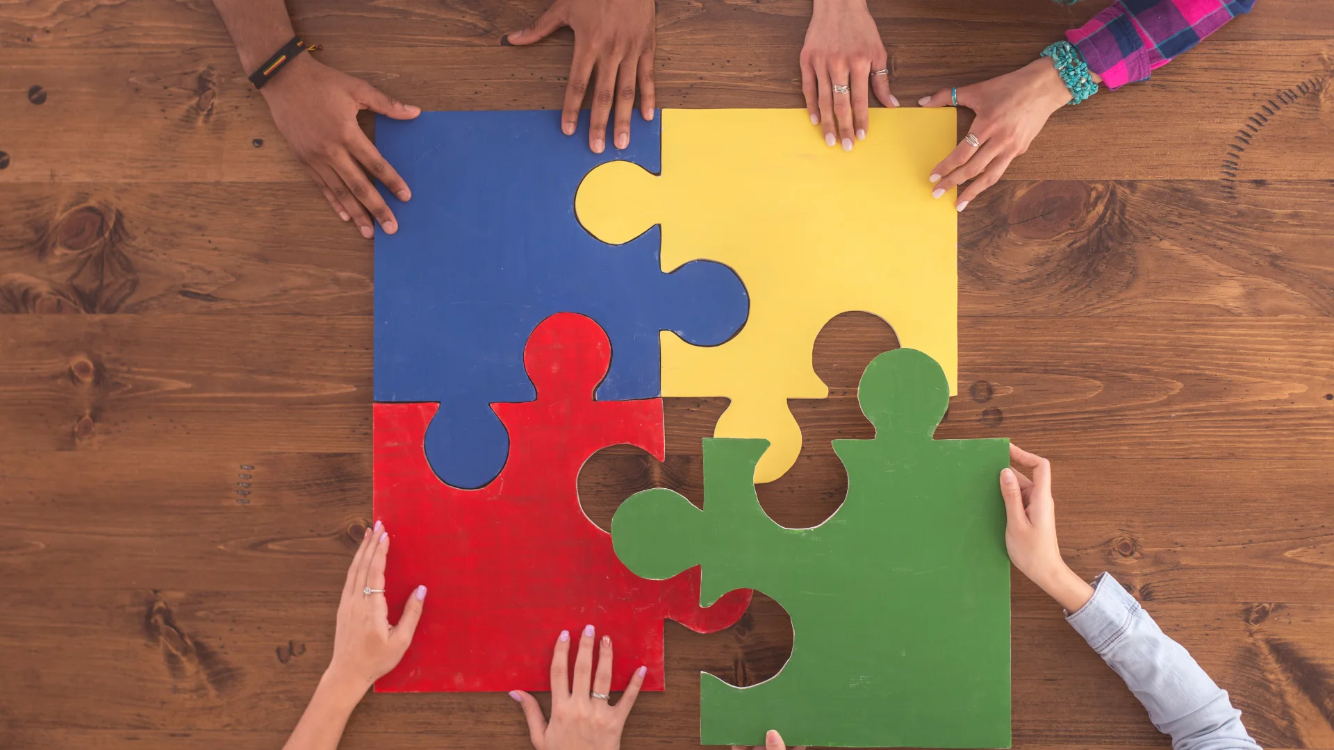
What does it mean to design truly inclusive digital experiences? For many neurodivergent individuals—especially autistic users—today’s interfaces are overwhelming, inconsistent, and needlessly complex. The problem isn’t just about bad UI; it’s about cognitive overload, accessibility gaps, and a tech industry that often forgets its users aren’t all wired the same.
In this episode, we unpack how common design patterns can unintentionally exclude autistic users—and what we can do about it.
Hidden Elements = Hidden Barriers

One of the most common frustrations autistic users report is hidden or ambiguous content. Whether it’s hamburger menus, color-coded labels with no meaning, or tooltips that only appear on hover, these micro patterns add friction.
Autistic users often prefer:
- Clear structure with visible information
- No surprises: predictable, consistent UI
- No need to decode visual metaphors (like the infamous hamburger menu)
🔍 Design takeaway: Use progressive disclosure only when it enhances clarity. Don’t bury essential info.
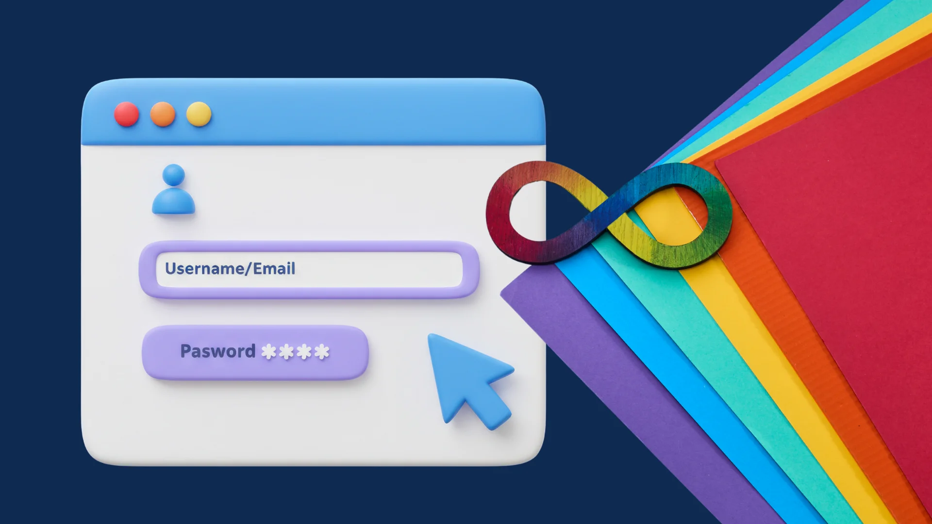
Color ≠ Communication
Autistic users—especially those with co-occurring sensory sensitivities—often find color cues confusing or overwhelming.
As one autistic developer puts it:
“When I see different colors, I assume they mean something. But most of the time, they don’t.”
📌 Best Practices:
- Never rely on color alone to convey information
- Use high contrast and allow users to toggle color themes
- Ensure every visual cue has a textual equivalent
Interface Fatigue Is Real
A bad UI isn’t just annoying—it’s exhausting for neurodivergent users. Interfaces that are too busy, too loud (visually or audibly), or packed with irrelevant imagery increase cognitive load.
What helps:
- Minimalist design
- Reduced animation or motion
- User-configurable interfaces (font size, spacing, color modes)
- Muted visuals by default (autoplay video? Hard no.)
Don’t Forget Emotional Safety
A good interface isn’t just usable—it feels safe. For autistic users, this often means:
- Reduced ambiguity in language
- Direct communication (no sarcasm or idioms)
- Error states that help, not shame
“Written language is something we all share. If I write sadness, everyone gets it. But if I use a crying emoji… it’s chaos.”
Tip: Write microcopy that is clear, literal, and actionable. Avoid idiomatic or sarcastic phrasing.
What Designers Can Do (Today)
- Test with neurodivergent users – not just in audits, but in actual usability studies
- Simplify interactions – reduce unnecessary steps, especially for communication-based actions
- Design calm environments – remove flashy elements, and offer an “easy mode” or “focus mode”
- Co-create with autistic users – bring their insights into the process early
Final Thoughts
Autistic users don’t need pity—they need respectful, intelligent design that meets them where they are. Designing for neurodiversity isn’t about making things “easier.” It’s about making them fair.
When we center design around real needs—not assumptions—we build interfaces that work better for everyone.
Resources