

2003 – 2006 🇧🇷
Bank of Brazil
Web Designer
90,000 employess - 100M downloads on Google Play

2009 – 2010 🇦🇺
Australia
Web Dev Coordinator
Created a variety of websites as a freelancer and worked at Local Government of New South Wales.

2010 🇧🇷
Brazil's General Attorney Agency
Senior Designer
Worked on their portal agu.gov.br redesign needs.

2011 – 2013 🇧🇷🇵🇹
Sectorial Dialogues EU-Brazil
Senior Designer Consultant
Created visual guidelines for the internal system, designed and coded sectordialogues.org portal (0→1).

2013 – 2014 🇧🇷
Brazil's Justice Palace
Senior Designer
Implemented, tested and improved the new visual guide for all Brazil's Federal Institutions (0→1).

2014 🇧🇷 🇺🇸
Pan American Health Organization (2x)
Senior Web Designer
Created a hot site for Patient Safety and improved services for health professionals (0→1).

2015 – 2016 🇧🇷
Bank of Brazil (2x)
Senior Designer
Worked on the redesign of their intranet, internet and mobile app team.

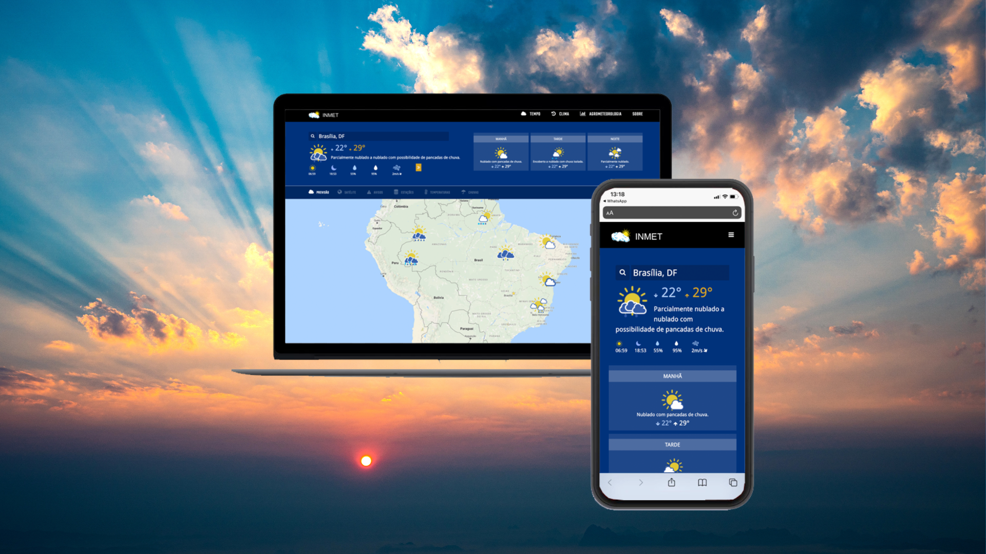
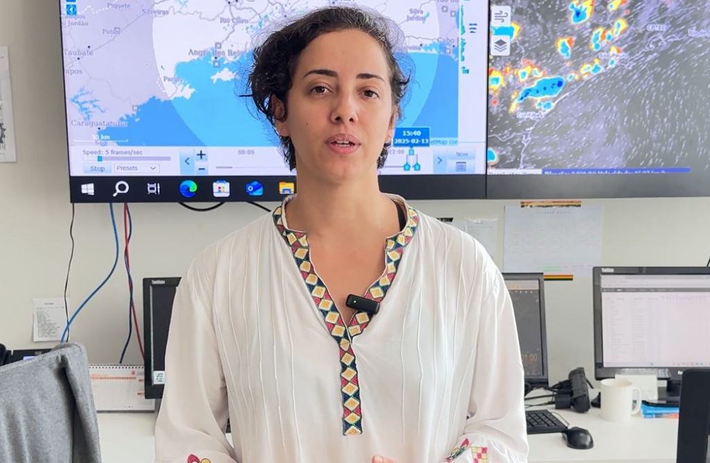
2016 – 2018 🇨🇭🇧🇷
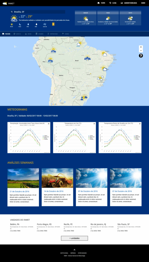
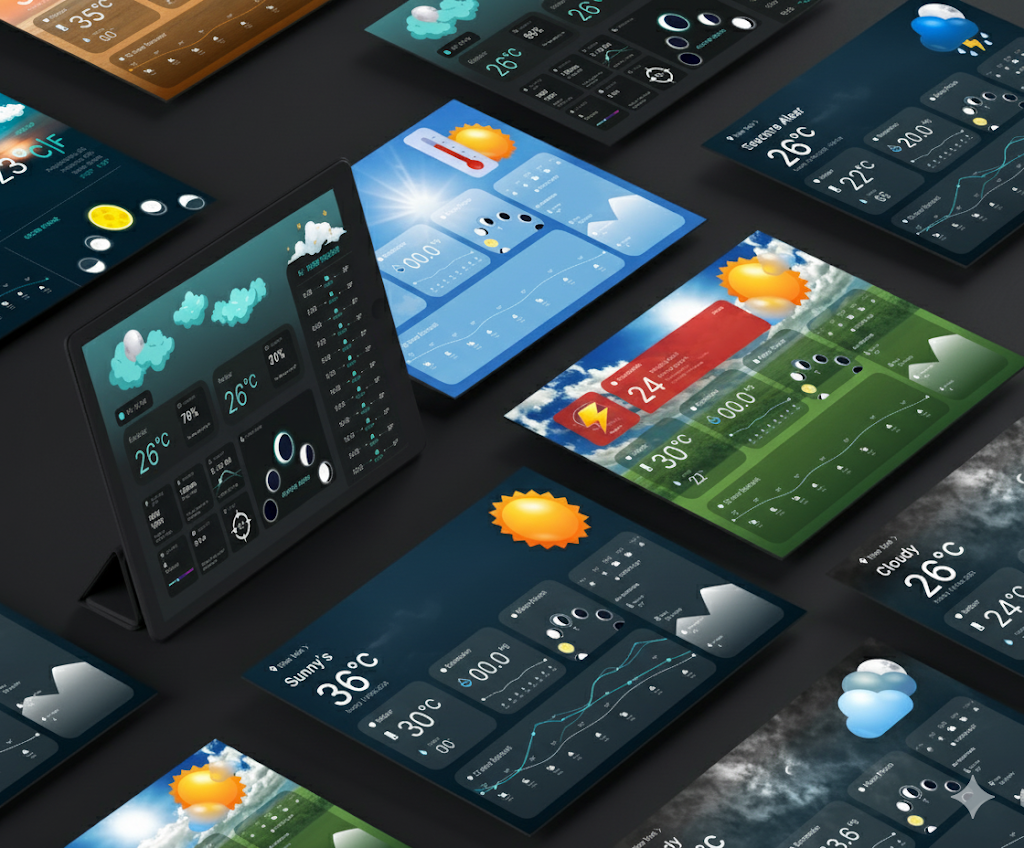
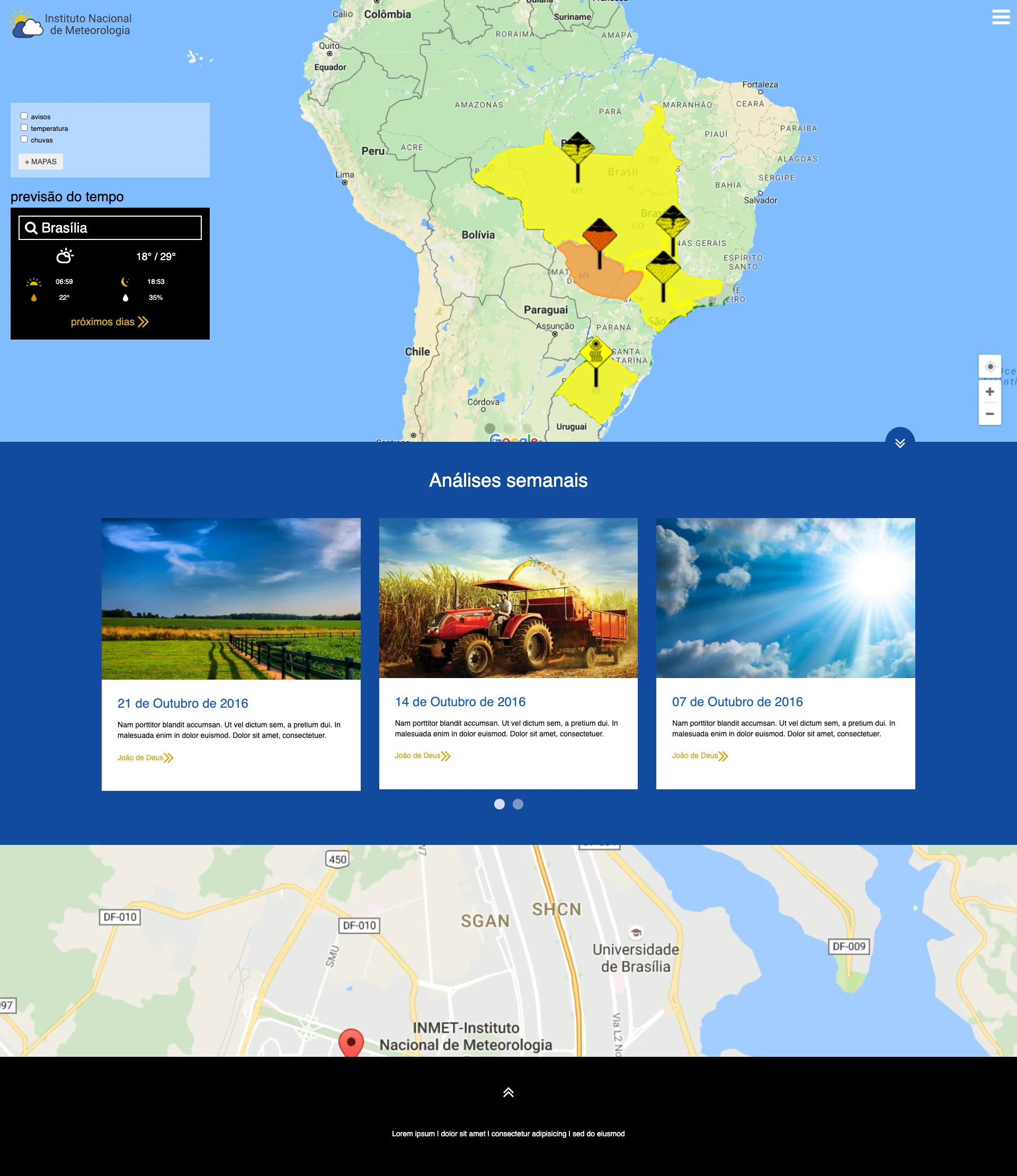
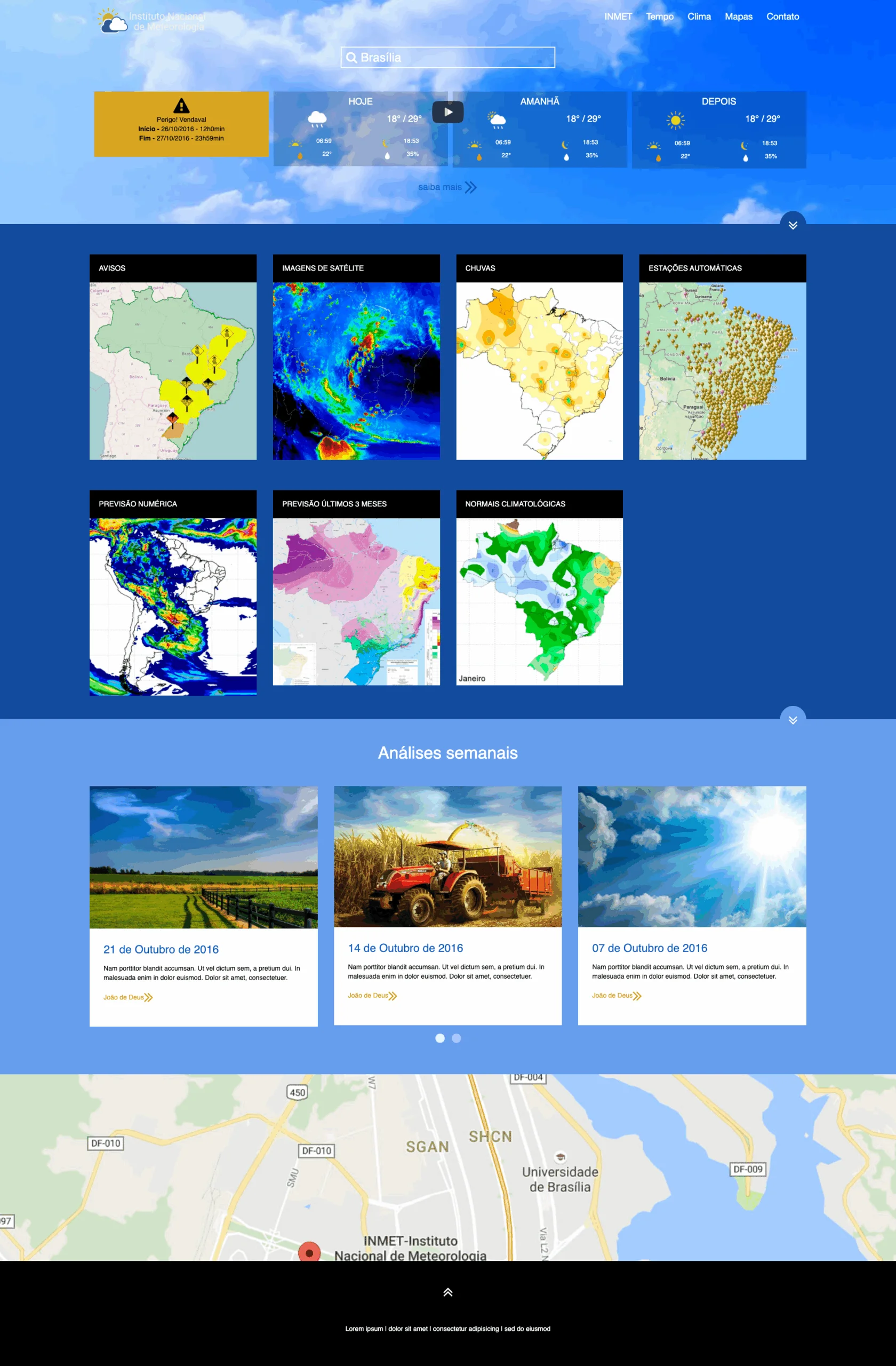
World Meteorological Organization
Senior UX Designer
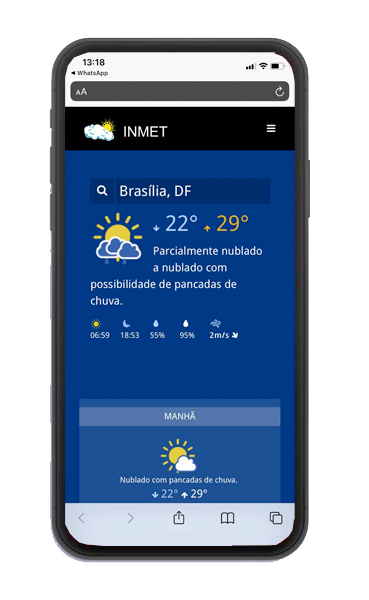
Modernized Brazil’s Meteorological Institute portal, unified four monitoring systems, redesigned intranet and email tool.

2018 – 2021 🇨🇦
Senior Designer
Worked 2.5 years at Brazen Bull (responsive websites & design artifacts). Contractor for HSBC.

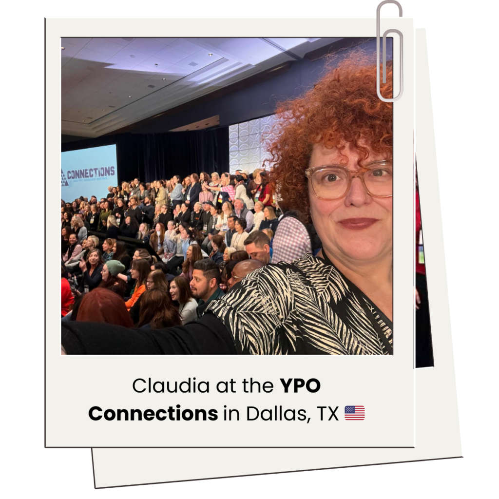
2022 – 2025 🇺🇸
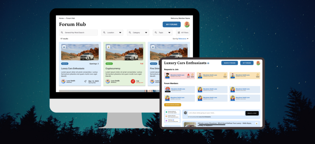
YPO.org
Senior UX/UI Designer
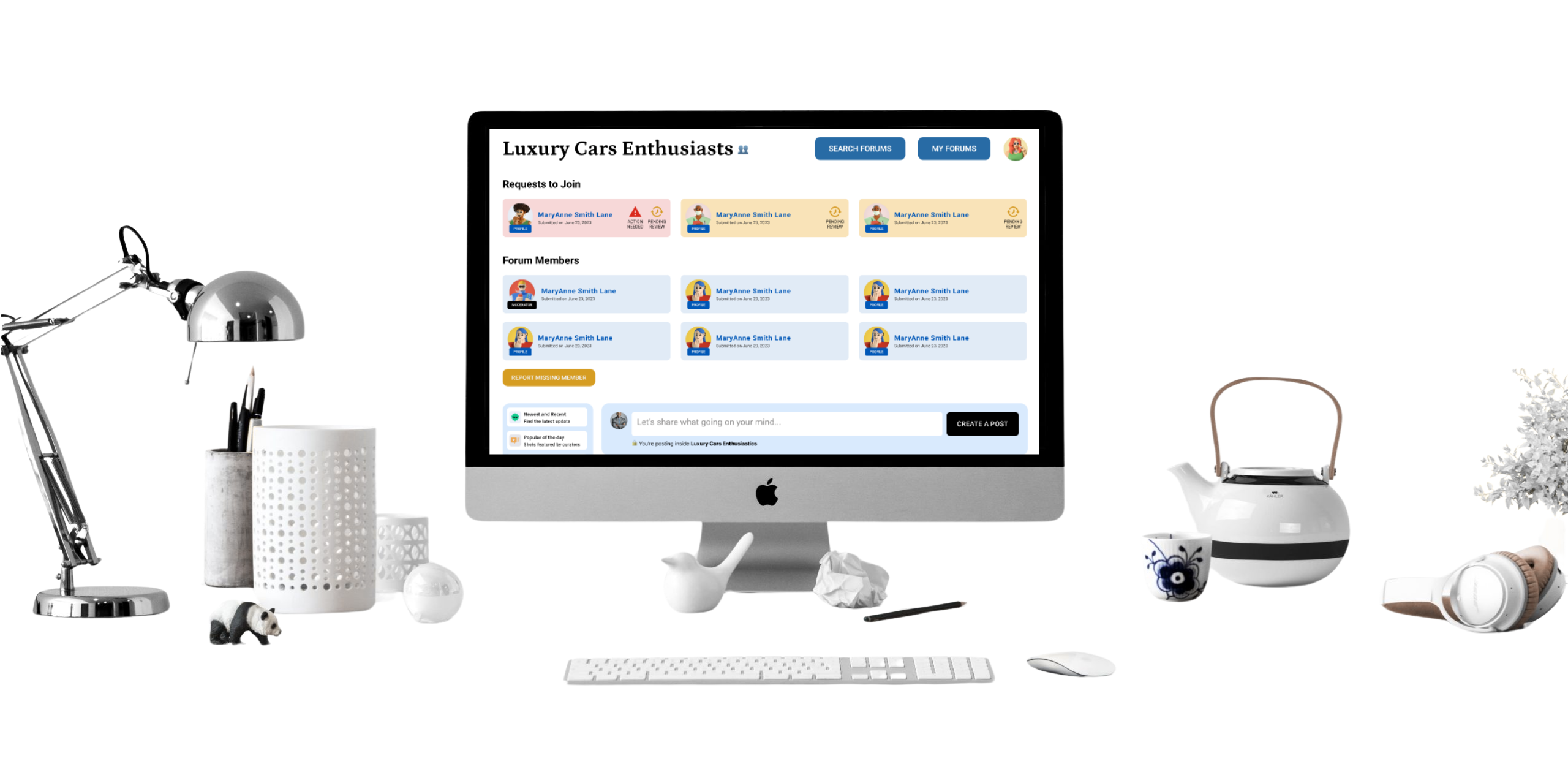
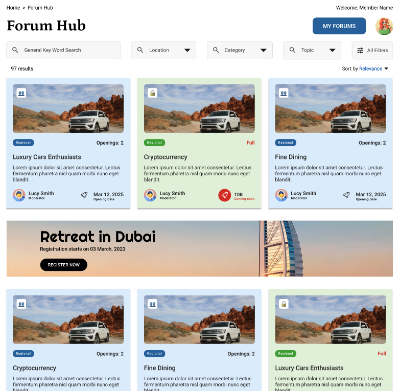
Designed Forum Hub, Advanced Member Search, Member Profile, Communities Portal. Leading Design System initiative across 9 platforms (0 → 1).

AI Prototyping
Using AI to scaffold content, IA, and early-stage prototypes
AI Tools
Testing different tools and workflows to understand what actually added value

Moving Quickly
Validating ideas quickly before committing engineering effort

Pivoting
Pivoting direction when assumptions proved wrong


Legacy architecture
Salesforce foundation; heavy, slow, desktop‑first
Fragmented Communication
Members juggled WhatsApp, Slack, and email.

Dismal engagement
<20% of members engaged monthly

Trust Deficit
No mobile responsiveness or accessibility. Unclear privacy boundaries.


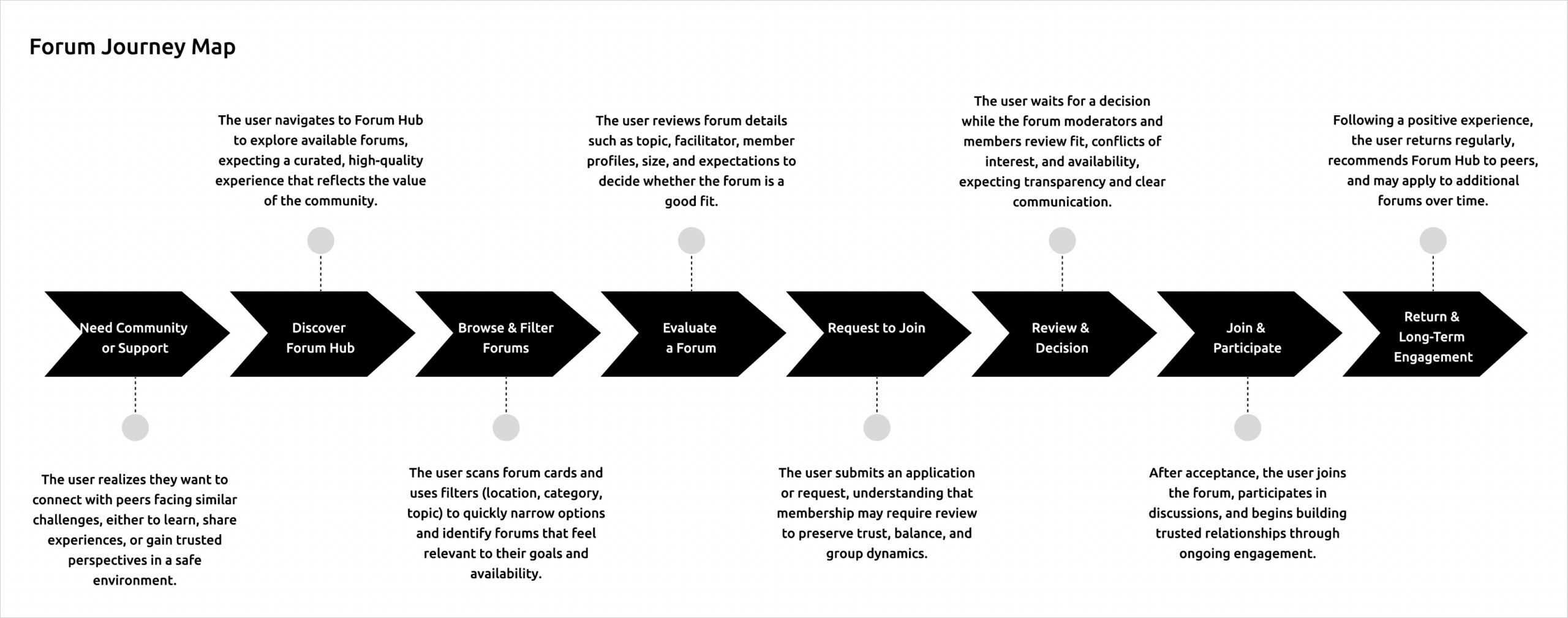
Browse & Filter
Product-like discovery patterns that feel familiar and intuitive

Smart Personalization
Recommendations without exposing private member context

Belonging, Not Clicks
Optimizing for time-to-meaningful-connection
Familiarity

Privacy
Clarity

Consistency


Workshops & Card Sorting
with leadership, citizens, local farmers and meteorologists to capture diverse needs.
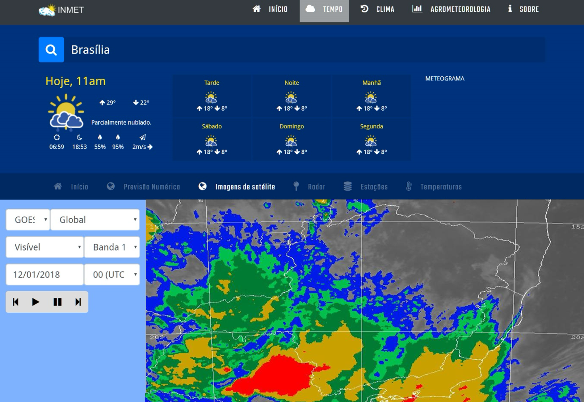
User Journeys
mapped different use cases: daily forecasts, agrometeorological decision-making, aviation safety, and technical reporting.
Usability Testing
ran pre- and post-redesign sessions using INMET’s internal lab to validate improvements
Customer Service Feedback
leveraged support team insights to fill gaps, since the old portal had no analytics or usage tracking.

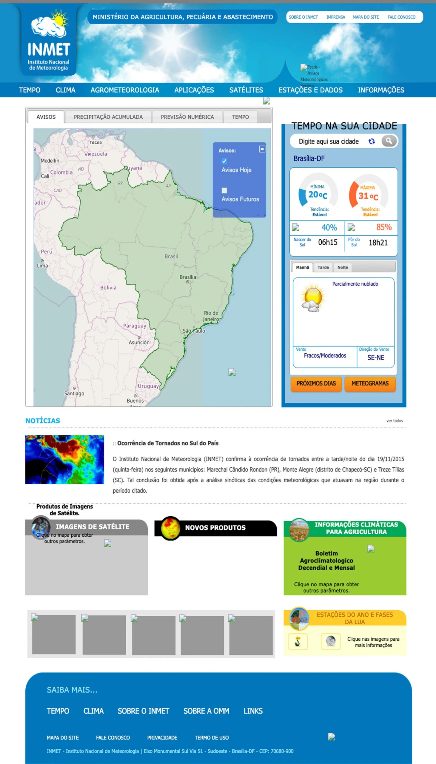
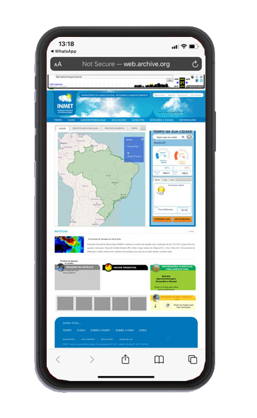
Too Technical
“There’s a lot of data here, but I don’t really understand what it means for me or what I should do with it.”

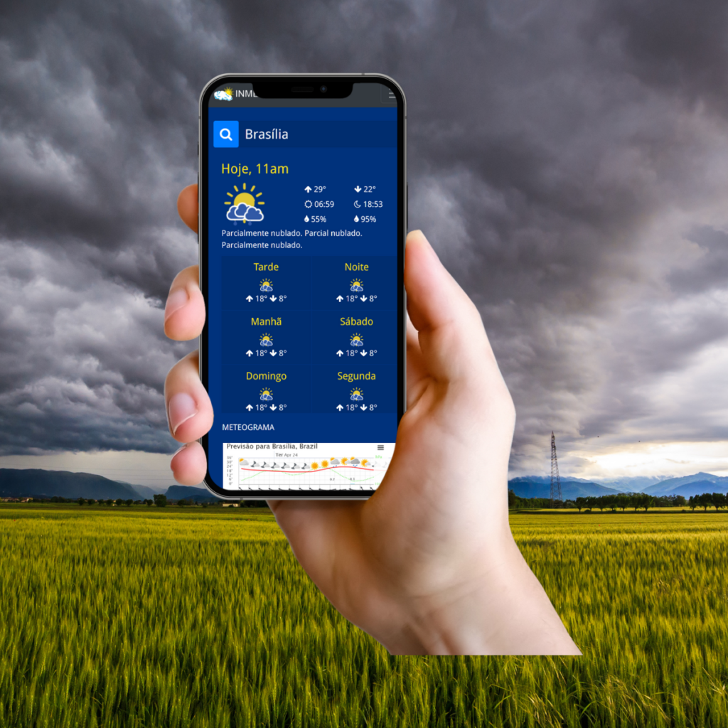
Not Mobile-Friendly
“I usually check the weather on my phone, and this is very difficult to read and navigate on a small screen.”

Hard to Find Key Info
“I just want today’s forecast, but I couldn't find it.”

Low Trust in the Experience
“I know this is official information, but the site feels outdated and confusing, so I end up using another app.”


| Feature | INMET (Before) | Climatempo | AccuWeather | Weather.com |
|---|---|---|---|---|
| Official Data Source |
|
|
|
|
| Citizen-Friendly Forecast |
|
|
|
|
| Mobile-First Design |
|
|
|
|
| Localized for Brazil |
|
|
|
|
| Modern User Experience |
|
|
|
|
| Ads-Free |
|
|
|
|


Unified design language

Reduced engineering ambiguity

Cross-team alignment

Accessibility compliance

Fewer design debates

