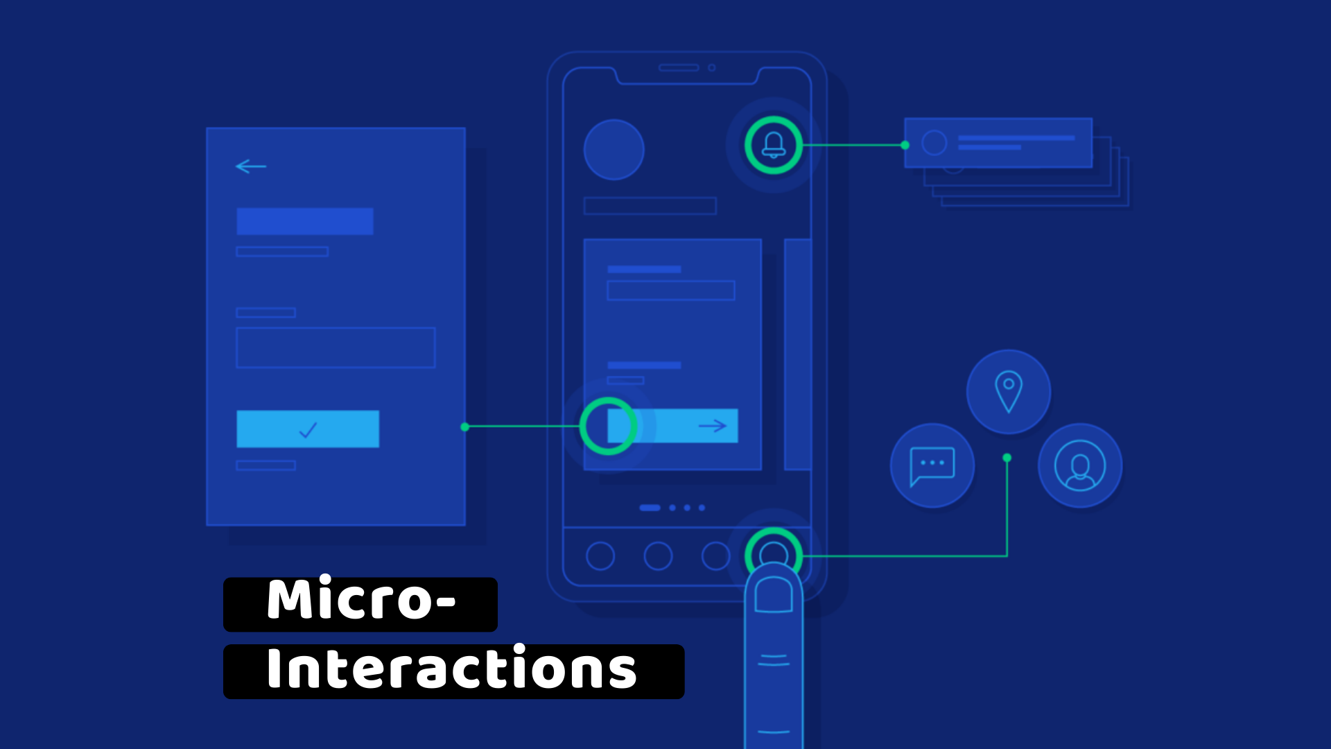
But as a seasoned designer, I’ve learned that this is also the most critical point for ensuring your product is truly accessible. A stunning wireframe is meaningless if its final execution excludes a significant portion of your audience.
Prototyping for accessibility isn’t an extra step; it’s the fundamental discipline of a designer who thinks about all users from the very beginning. It’s a proactive, not reactive, approach that saves time, reduces cost, and leads to a superior product.
This guide outlines my proven, step-by-step workflow for moving from a wireframe to an accessible prototype, ensuring every user can engage with the final product with dignity and ease.
Why Prototyping for Accessibility from Day One?
The business case for accessible prototyping is just as compelling as the ethical one. Fixing accessibility issues after a product has been built is dramatically more expensive and time-consuming than addressing them during the design phase. A single line of code can’t fix a flawed user journey.
By building accessibility into your prototypes, you:
De-risk the Project: You identify and solve potential usability issues for a wider range of users before a single line of code is written.
Empower Your Team: You give developers a clear, annotated guide to what an accessible experience looks like, reducing guesswork and costly rework.
Elevate the User Experience: You create a more robust, intuitive, and ultimately more delightful product for everyone, not just those with disabilities.
The W3C’s Web Accessibility Initiative (WAI) strongly advocates for including accessibility throughout the entire design process, from ideation to testing. This isn’t just about compliance; it’s about creating better experiences for all.
My 5-Step Accessible Prototyping Workflow
Step 1: Start with the Right Tools
Your tool of choice is your first line of defense. Modern design tools like Figma and Sketch offer powerful features and plugins to help you build accessibility into your prototypes from the start.
Color Contrast Checkers: Use plugins to instantly check that your color pairings meet WCAG 2.2 contrast ratios. This prevents you from falling in love with a color palette that isn’t accessible.
Semantic Layering: Use proper labeling for elements in your design file. This helps you think about the final code structure (e.g., buttons, links, headings) and ensures a smoother handoff to developers.
Step 2: Define Interactions for All
A prototype is more than a visual mock-up; it’s a simulation of a user’s journey. Use it to define not only what the user sees but also what they can do with their keyboard or a screen reader.
Keyboard Navigation: Design a clear and logical tab order that follows the visual flow of your interface. Users who rely on keyboards should be able to navigate seamlessly.
Focus States: Explicitly design the focus state for every interactive element (buttons, links, form fields). This is the visual cue that tells a user where they are on the page. A well-designed focus state is a hallmark of an accessible experience.
Screen Reader Annotations: Add notes to your prototype that specify how a screen reader should announce an element. For example, a button might have the note: “This button announces ‘Click to download the report.'”
Step 3: Test with Real Users
No amount of technical knowledge can replace real user feedback. Conduct usability testing with participants who have a range of abilities.
Inclusive User Research: Recruit participants with diverse needs, including those who use screen readers, keyboard-only navigation, or have cognitive disabilities.
Observe and Learn: Watch how they interact with your prototype (my favorite part! :). Are there moments of confusion? Do they struggle to complete a simple task? Their feedback is a critical ingredient for a successful, accessible product.
Step 4: Annotate for Your Team
A prototype is a shared blueprint. Your developers and content strategists need to know your accessibility intentions.
Use Documentation: Create a dedicated page in your prototype file for accessibility notes. This should include:
- Color palette information and their contrast ratios.
- Intended screen reader text for complex elements like charts or icons.
- Dynamic content behavior, such as what happens when a page refreshes or an error message appears.
Step 5: The Handoff: A Clear Communication
The handoff is not a delivery; it’s a collaboration. Present your prototype to the development team as a guide, not a final command.
Walk Them Through the Journey: Use the prototype to walk the team through a user journey, explaining not just the visual design, but the accessible interactions and the why behind them.
Be a Partner: Position yourself as a partner in building an accessible product. The best results come from a shared understanding and a mutual commitment to the user.
Conclusion
Prototyping for accessibility is your superpower as a designer. It’s the moment where you can transform a simple idea into a product that serves all of humanity. It may require a little more intentionality upfront, but the payoff is immense: a more robust product, a more efficient team, and a more inclusive world.
As designers, our responsibility is to build the future. Let’s make sure that the future is accessible to everyone.
References
Web Content Accessibility Guidelines (WCAG) 2.2: The foundational guidelines for digital accessibility.
URL: https://www.w3.org/TR/WCAG22/
W3C’s Web Accessibility Initiative (WAI): A comprehensive resource on how to make web technologies accessible to people with disabilities.
User Research with People with Disabilities: A guide from the WAI on how to involve users with disabilities in your design process.


